QUICK FACTS ABOUT THIS SURVEY
- This survey received approximately 450 responses.
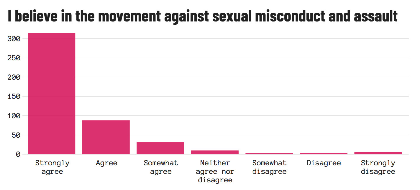
- More people believe in the issues the movement supports rather than the movement itself.
- The top 3 issues participants cared about were environmental, education and racial equality.
- Almost half the participants shared that they do not talk about the movement online.
- Other than social media, participants shared that the most frequent place they saw news on the movement was through broadcast news.
Below is the data collected from a survey of 500+ participants from around the country. This page begins with an overview of who participated in this survey based on gender and race. Following are graphs from each question on the survey. Further work, such as crosstabulations, would need to be done in order to maximize the value of these graphs.
Question #23: What is your gender identity?
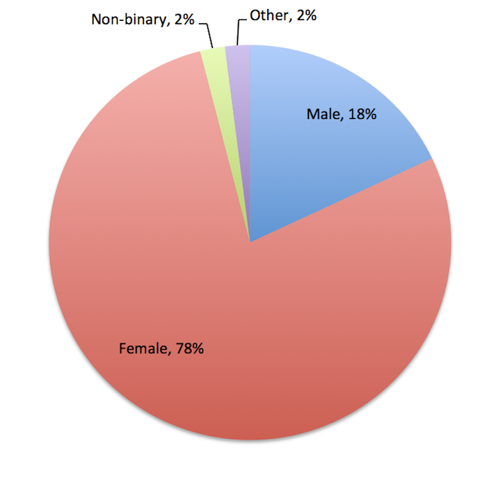
One of the later prompts in this survey was "what is your gender identity"? This question was left open-ended in an attempt to avoiding “othering” respondents by asking them to select an answer that did not truly represent their identity (e.g. responses for “what is your gender identity” are typically listed in a multiple choice format and include “male,” “female” and “other” with an option to fill in what “other” represents to that respondent.). By leaving the questions open-ended it allowed for respondents to identify themselves as who they are, not attempt to fit themselves into the mold of the survey.An appendix of entries can be found
Question #24: What is your race?
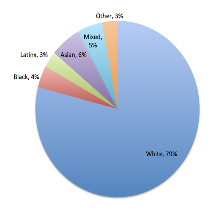
The other prompt, “what is your race?”, was also left open ended. This was done in an attempt to avoid "othering" respondents as well but it was also done so that people could write in their race should the identify with more than one (i.e. Latinx and White). This left me with the deicion to categorized people as "mixed" if they identified with more than one race or to have a category for each response. Ultimtately, I decided on the former so that each section would be easier to read and there would not be slivers of sections that were near invisible. An appendix of entries can be found
Question #1: Are you registered to vote?
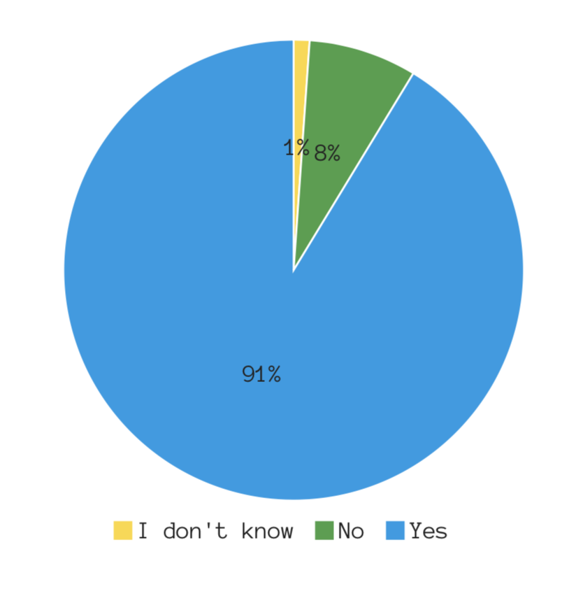
This first graph indicates that the majority of people are registered to vote. Seeing as the age bracket with the highest response rate was 18-24, it can be deduced that young people seem to be registering to vote considering only 8% of respondents reported not being registered to vote.
Question #2: With which political party do you most identify?
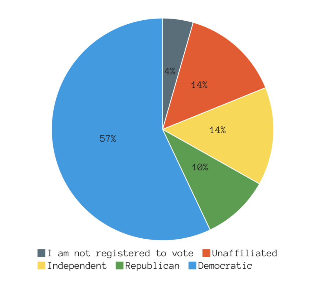
Most participants identified themselves as Democrats. Participants from this survey are also more likely to identify as an Independent or unaffiliated than as a Republican.
Question #3: With which political ideology do you most identify?
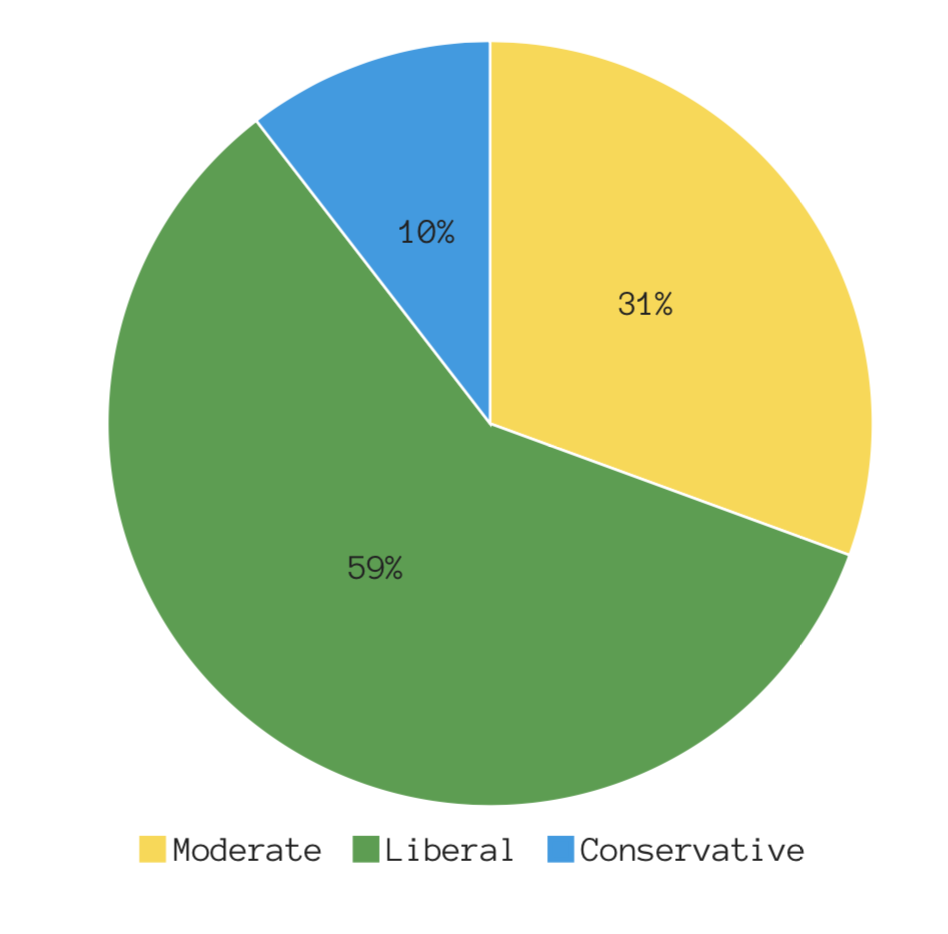
Given the numeric breakdown of this graph, it seems those who identify as Democrats are more likely to consider themselves a Moderate than those who identify as a Republican.
Question #4: Which of the following issues do you care most about?
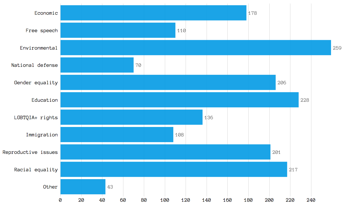
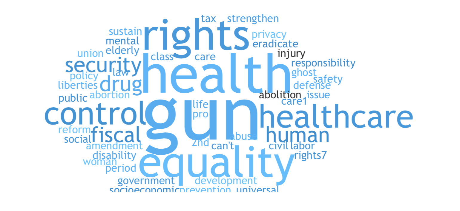
The top 3 issues participants cared most about are environmental, education and racial equality. The top 3 issues people care least about are something “other”, national defense and immigration. Write-ins for the “other” category ranged from health care, gun control and other, more specific subsections of the above issues. A word cloud for write-ins in the "other" category is below.
Question #5: Which of the following social media platforms do you use most regularly? (rank 1-7 with 1 being most used and 7 being least used)
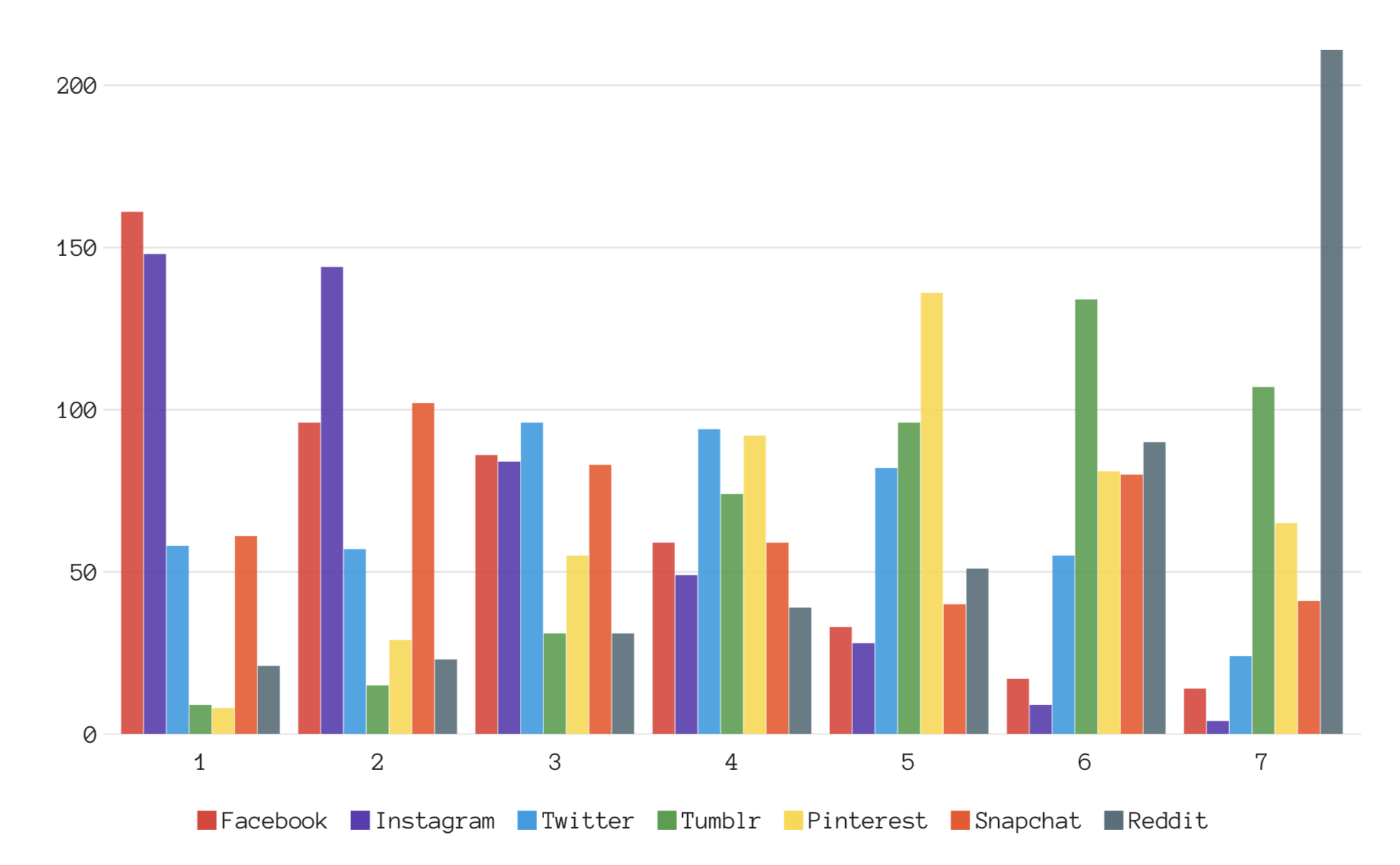
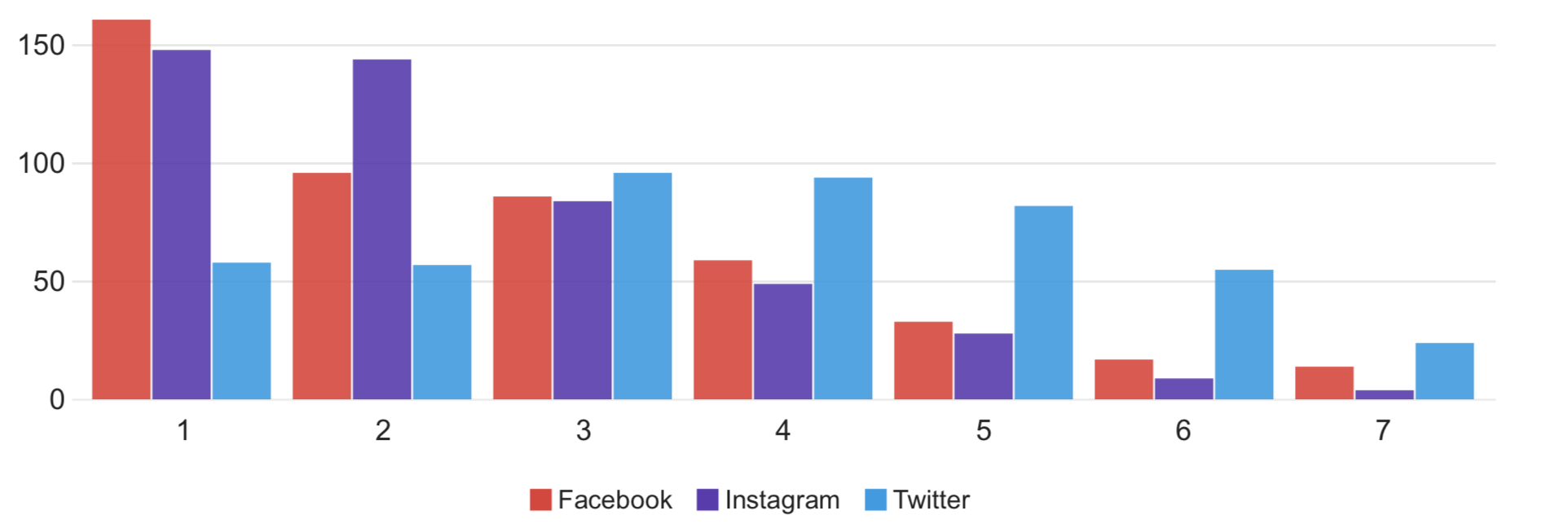
The participants who took this survey indicated that their most used social media platform is Facebook, followed by Instagram and then Twitter. This is consistent throughout the rest of the data. The graph below is specific to Facebook, Twitter and Instagram and notes that most people ranked Facebook as their #1 most used platform, followed by Instagram and then Twitter.
Question #6: Which of the following hashtags have you seen?
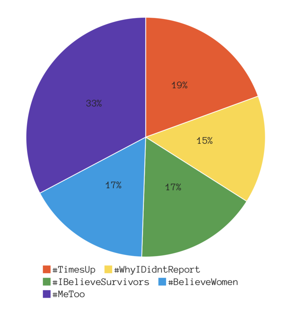
“Me Too” was the most identifiable hashtag, followed by “Time’s Up.” The other three hashtags listed in this question, #BelieveWomen, #IBelieveSurvivors and #WhyIDidntReport, have similar responses. These three hashtags began circulating during the Kavanaugh hearings in late September of 2018.
Question #7: Where did you first see news on the movement against sexual misconduct and assault?
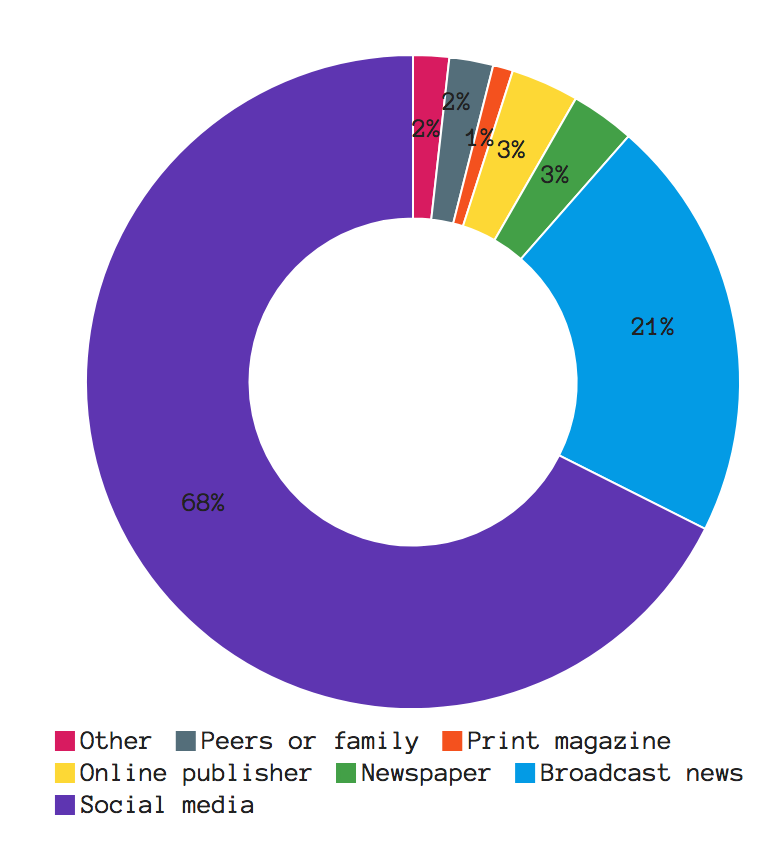
Social media far surpassed any other medium as far as where participants first became aware of the movement against sexual misconduct and assault with broadcast news being the second most popular medium. As far as activism marketing, this is an important metric to take into consideration when planning campaigns.
Question #8: Where on social media have you seen posts about the movement against sexual misconduct and assault?
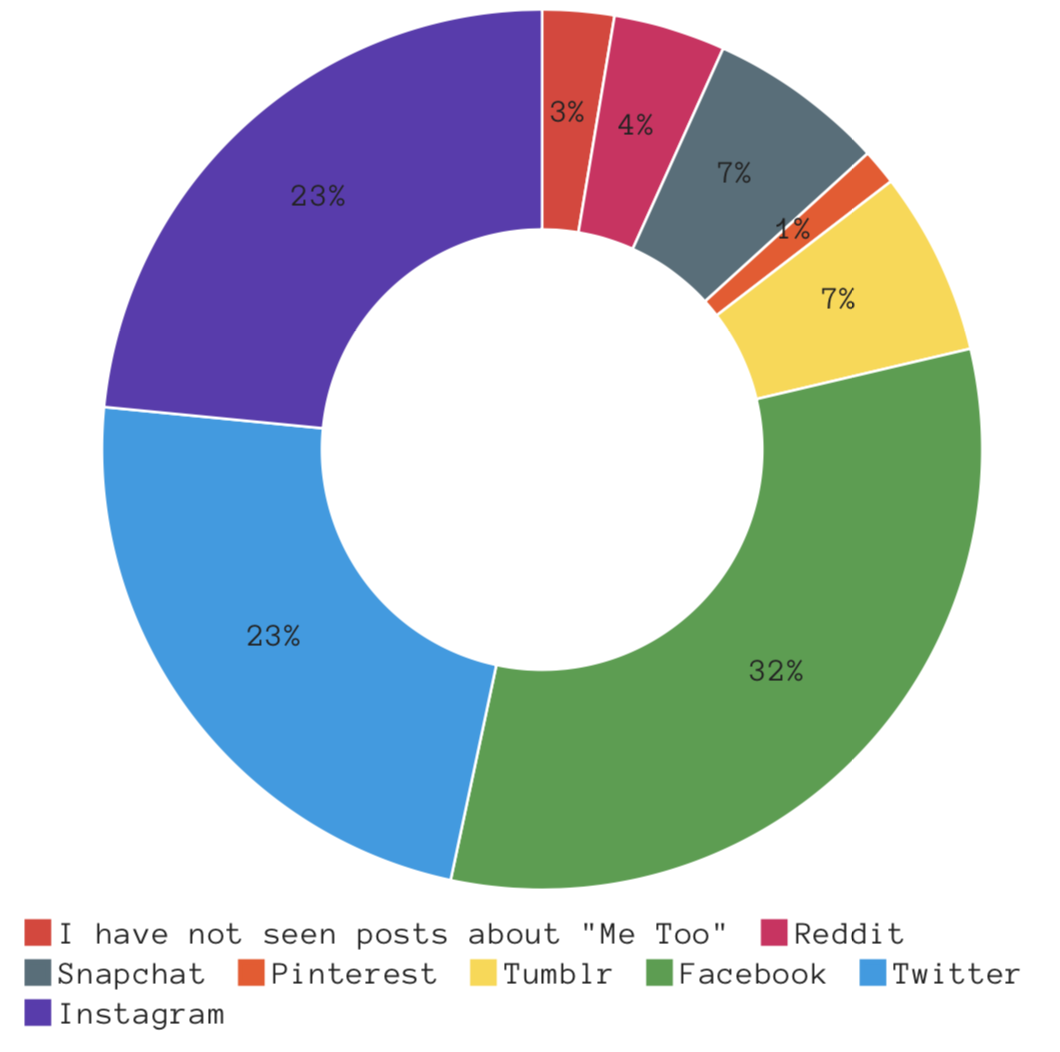
Facebook, across the entire study, was the most popular social media platform as far as where participants saw news and/or posts about the movement. Instagram and Twitter were virtually tied for this question but there is a variation in the next graph.
Question #9: Among the following social media platforms, where did you see the most posts about the movement against sexual misconduct and assault?
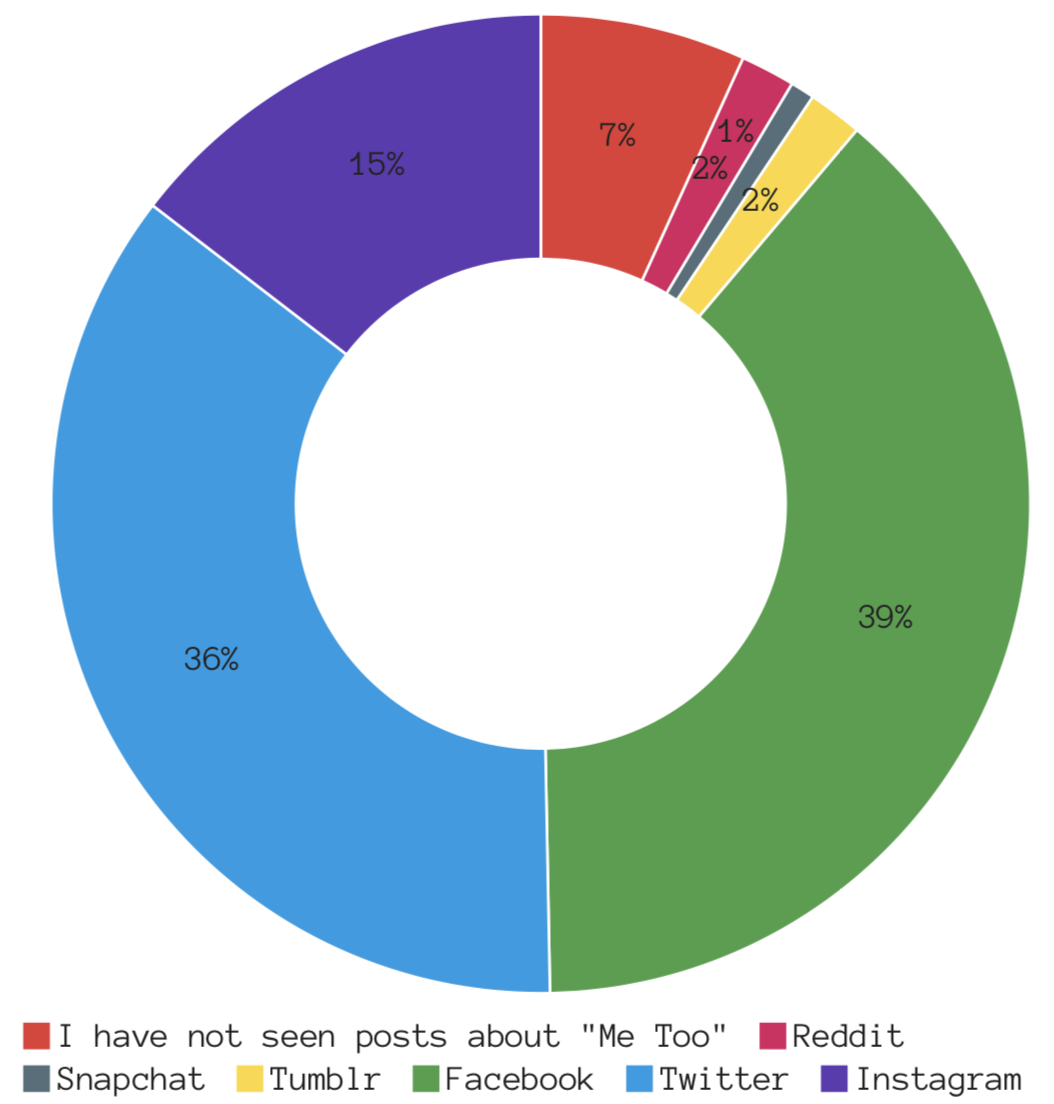
Again, Facebook seems to be the most popular platform for these issues. But it is also important to note the distinction between Twitter and Instagram. The question asks where participants saw the most posts and it’s clear that the ordering remains consistent with the patterns visible earlier on in the survey.
Question #10: Where have you seen news of the movement against sexual misconduct and assault other than on social media?
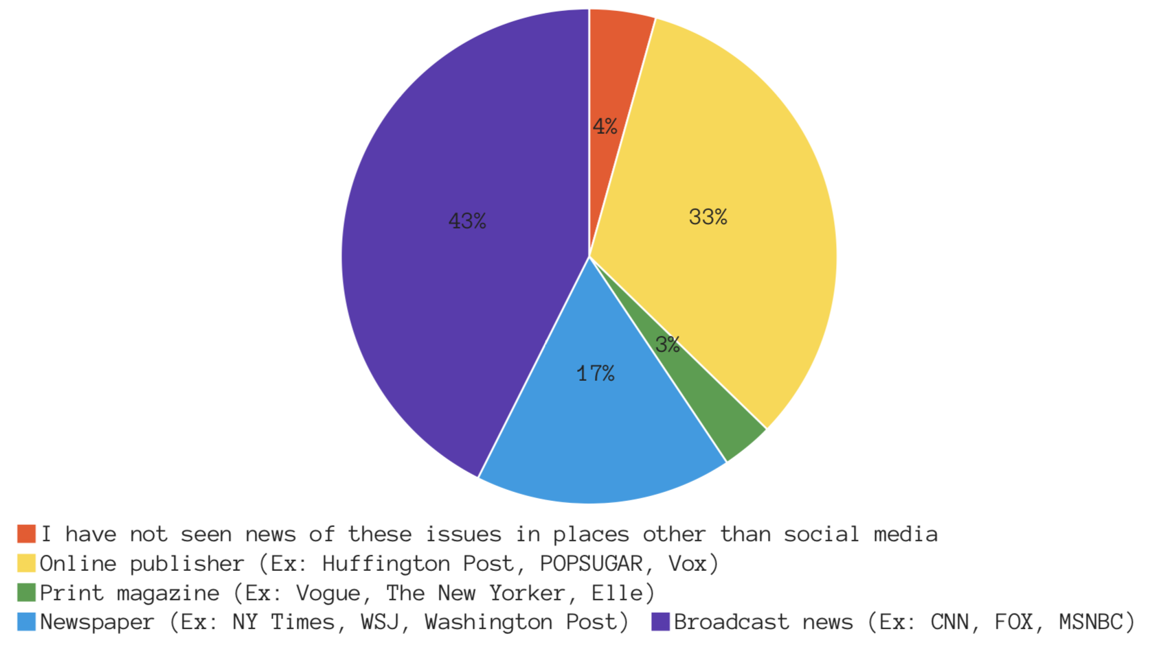
Broadcast news was the most popular medium of media for participants’ exposure to the movement, followed by an online publisher (such as Huffington Post or POPSUGAR). Newspapers also received a solid amount of responses but this question does not make a distinction between a print copy of a newspaper and an online version.
Question #11: Have you ever interacted with the movement against sexual misconduct and assault on social media?
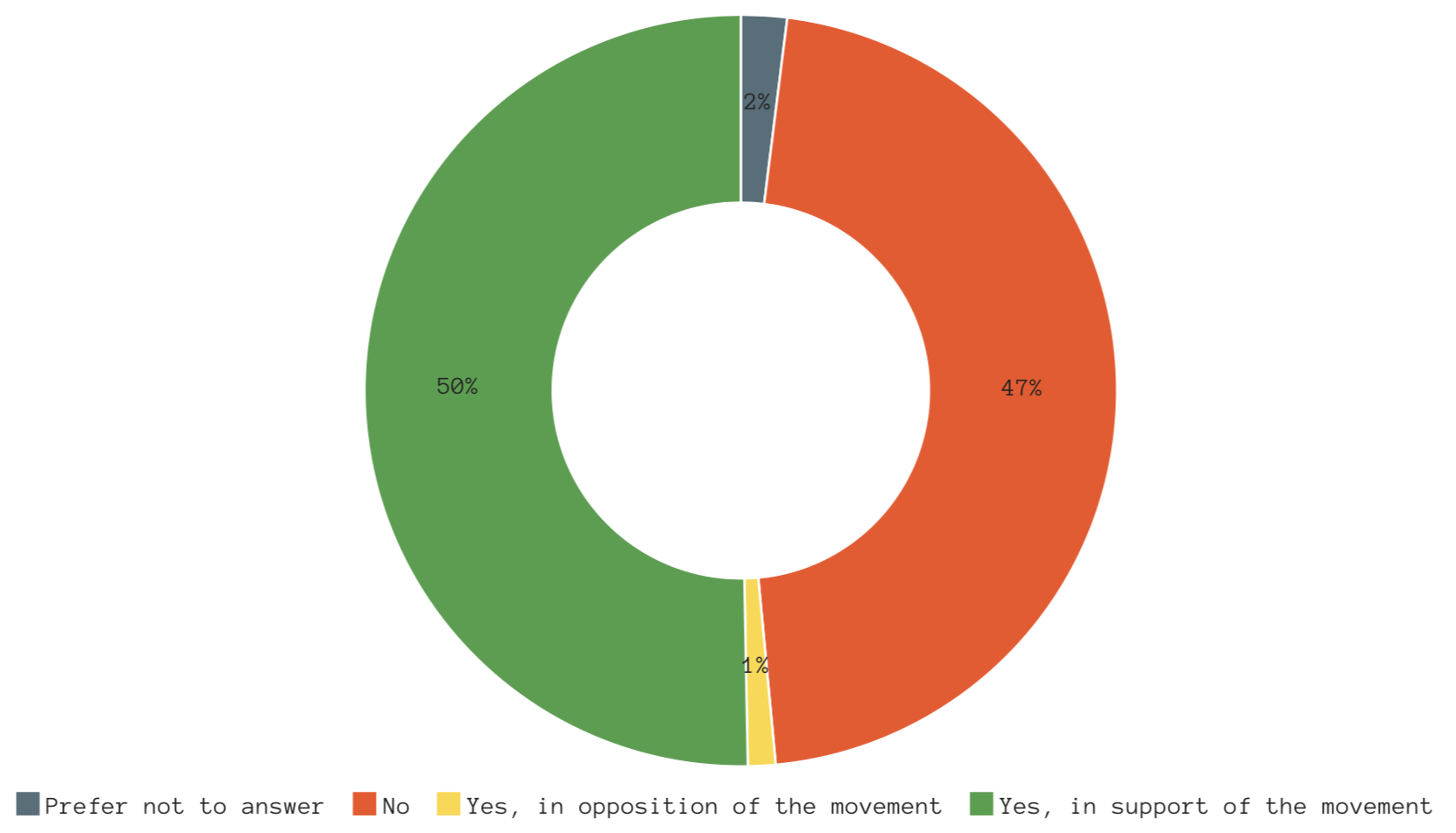
It seems about half the participants reported that they have not interacted with the movement on social media. Most respondents reported that they support the movement, but it seems that support does not translate to posting on social media.
Question #12: If you have interacted with the movement against sexual misconduct and assault on social media, on which platforms did you post?
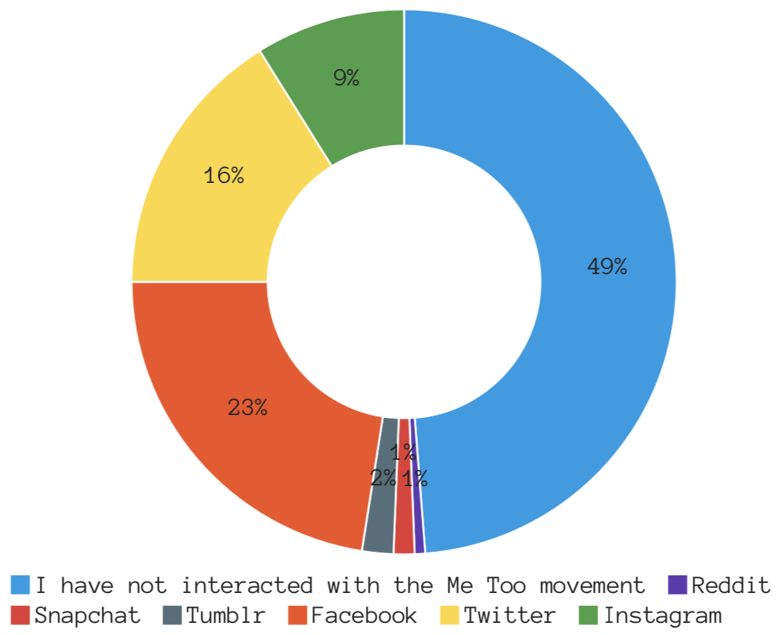
The pattern of Facebook, Twitter and Instagram being the order of most popular platforms to post about the movement remains consistent when participants noted where they have posted about these issues.
Question #13: Please select the attitude that most align with the statements listed.


Question #14: Do you talk about the movement against sexual misconduct and assault among your friends IN PERSON?
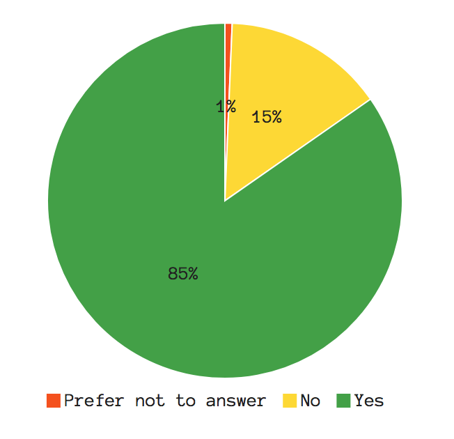
The majority of people do talk about this movement with their peers in person -- this number drastically increases when asked about interacting with the movement online (next graph).
Question #15: Do you talk about the movement against sexual misconduct and assault among your friends ONLINE?
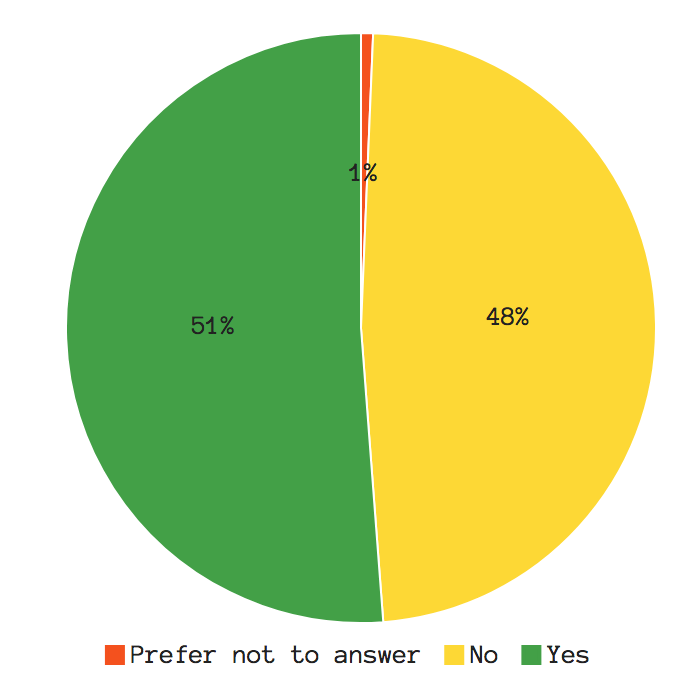
This response seems to be virtually split; with half responding “yes” and the other half responding “no.” If this survey was done again, another question would have been included that prompts participants as to why they are unwilling to interact with the movement online.
Question #16: Please select the attitude that most aligns with the statements listed.


Question #17: Have you ever attended a public event (i.e. public meeting, rally, march) in support of, or against, the movement against sexual misconduct and assault?
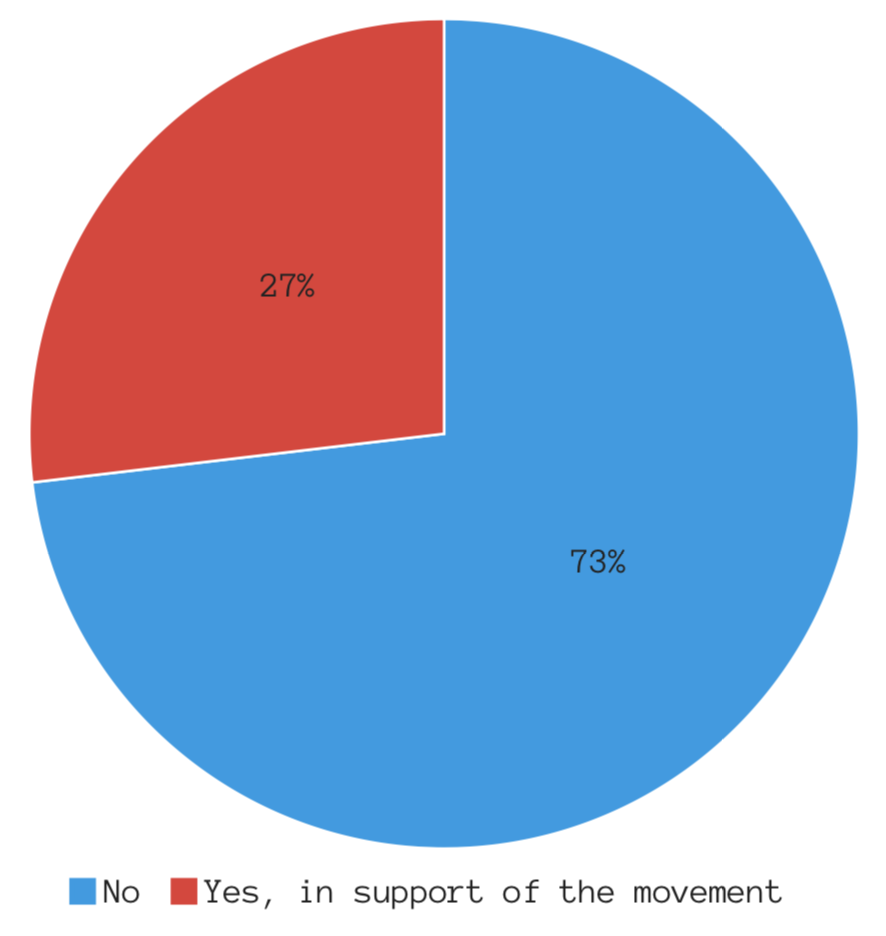
While people report supporting the movement in general, the majority of respondents also reported to not attending a public event related to the movement.
Question #18: Have you ever made a monetary donation to an organization that SUPPORTS the movement against sexual misconduct and assault?
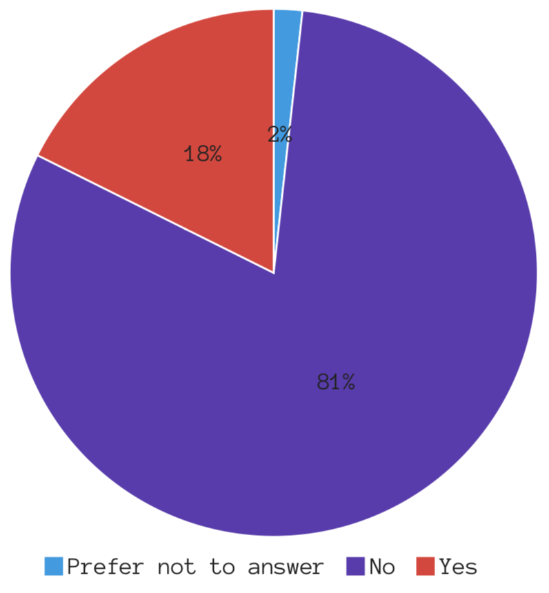
This graph is interesting because if it is compared to the above graph (#17) there is very close correlation to the amount of people who have attended a public event and those who have made monetary contributions to the movement.
Question #19: Have you ever made a monetary donation to an organization that IS OPPOSED the movement against sexual misconduct and assault?
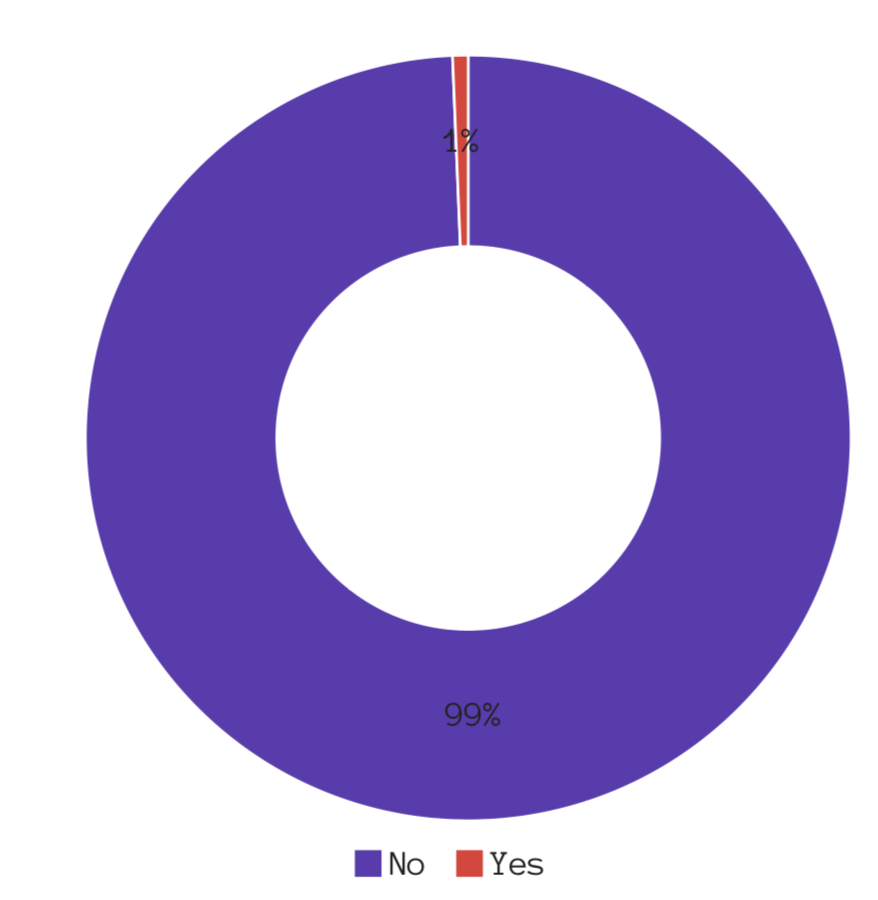
If this survey were to be re-submitted, there would be a prompt that asked people to which organization they’d made a donation. The number is so small that it begs whether people actually make donations to opposition movements/candidates, or they selected “yes” simply to be controversial.
Question #20: Do you support the movement against sexual misconduct and assault?
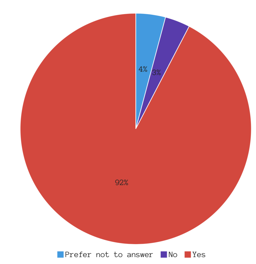
While the overwhelming majority of people report to supporting the movement, the number of those who oppose the movement was somehow puzzling. Even more so, 19 participants reported that they’d rather not answer this question – a higher number than those who oppose the movement.
Question #21: Would you support someone for public office that did not support the movement against sexual misconduct and assault?
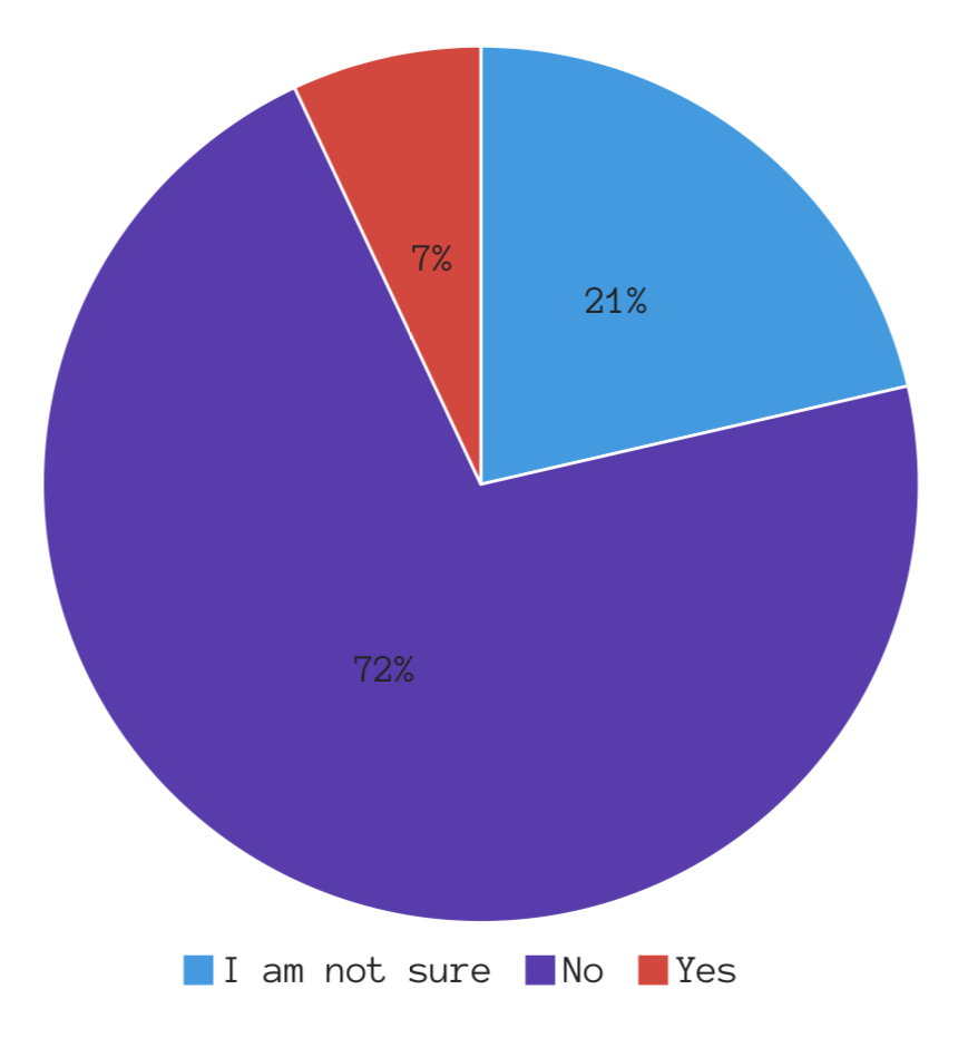
This question asks participants to make a personal political projection; whether they would still cast a vote for a candidate that opposed (or simply did not support) this movement. The results received were somewhat expected as it can be assumed that not everyone can make that kind of decision without understanding a candidate’s entire platform.
Question #22: How old are you?
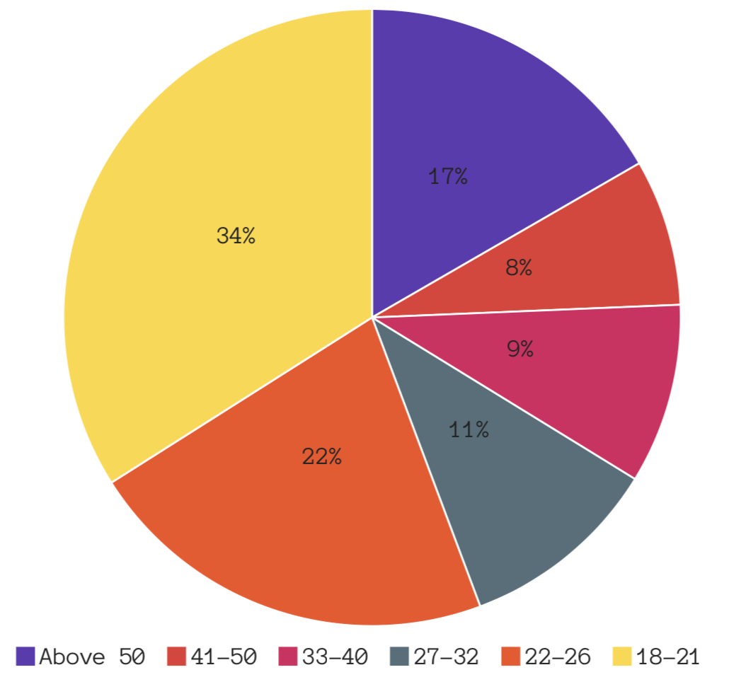
The age breakdown for this survey was surprising as it was assumed there would be a heavier participation in the younger categories since the survey was distributed on a college campus. Perhaps the even dispersion among 27-50 was due to the paid ads on social media or faculty/staff taking this survey since it was promoted using the various UConn listserv databases.